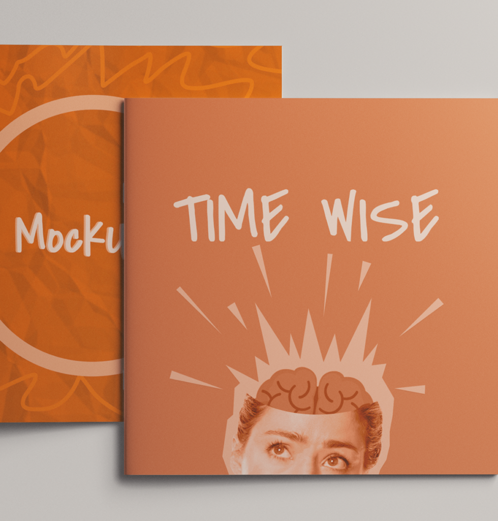
Design

Works

Environmental poster with a dark turquoise color background, a swimming orange koi fish, green lily pads inthe top left corner, and text at the bottom left corner.

Peace Day

Illustration

A single icon created using one of the Gestalt Principle is selected to be expanded into other collateral such as posters, murals, and a motion video for International Peace Day.

Shattered Self

Poster Collage

This collage reflects the fractured identities of abuse victims who feel unable to speak out due to fear of ridicule and shame. It is inspired by Demi Lovato’s song “29.”

Coraline

Packaging

The book cover draws inspiration from Coraline, using the iconic yellow raincoat as its primary color. A silhouetted hand stitching the title hints at the story’s eerie themes and builds anticipation.

Cosmic Vine

Packaging

Cosmic Vine is a concept wine brand that blends the personalities and bodies of wine with zodiac constellations and the natural elements associated with each sign.

Oriental Emergence

American Advertising Award 2026 | Silver

Publication

This annual newsletter celebrates Lunar New Year, aligning each issue with the corresponding Chinese zodiac sign. Each edition highlights traditions from a specific Asian country while promoting local San Antonio festivals.

SP Cafe

Branding

This rebrand reimagines SP, a local Vietnamese café, through a French café–inspired lens. Natural, earthy tones complement the interior and enhance its warm, inviting atmosphere.

Polish’d

User Interface

Polish’d is a booking app that simplifies scheduling nail services. It focuses on convenience and education through personalized onboarding, real inspiration, and direct interaction with technicians.

Death by Natural Causes

Publication

This project contrasts the beauty and danger of toxic plants, using clear visuals to aid identification and promote safety outdoors.

Time Wise

Campaign Branding

Time Wise is a campus campaign promoting productivity through interactive events and planning tools, using a bold, scrapbook-inspired visual style to create an engaging, relatable experience.

slowburn

American Advertising Award 2026 | Bronze

Campaign Branding

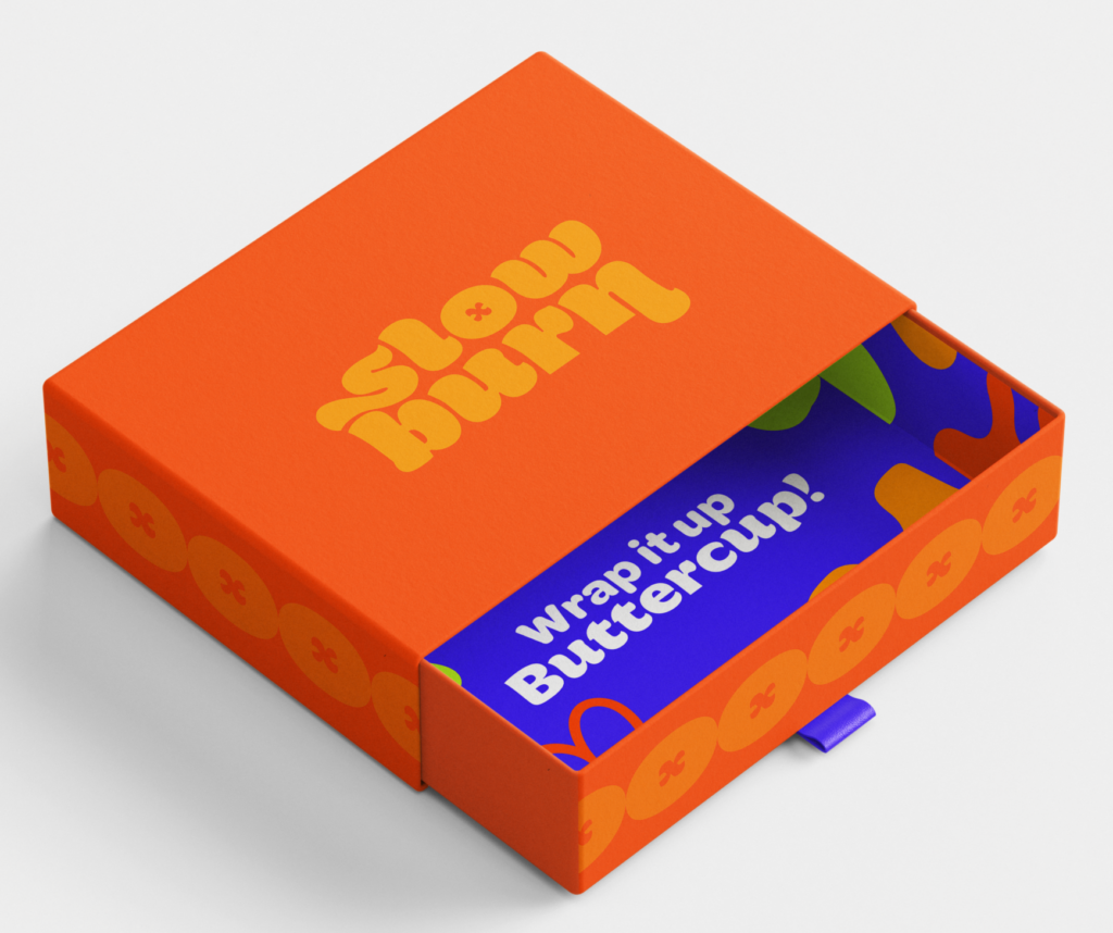
Many young people lack access to honest, inclusive, and practical sex education, and our campaign was created to change that through relevant, respectful, and realistic programs. Designed to engage a young audience, the visuals feature vibrant, contrasting colors, organic shapes, a friendly mascot, and Gen Z language for relatability.

Like What You See?